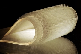
Felice Frankel has spent more than 25 years helping scientists and engineers create engaging and informative photographs and images depicting their work. Her images have appeared on the covers of many of the world’s leading scientific journals, and she has described some of the processes and methods involved in several books, as well as in classes and workshops at MIT and around the country, and an online class on MITx. Her latest book, “Picturing Science and Engineering,” published this week by MIT Press, is an exhaustive and profusely illustrated tutorial on how to create images of research that are informative, visually compelling, and scientifically accurate. In addition to working directly with scientists and engineers, Frankel is also a consultant to the MIT News Office. She spoke with MIT News about some of the important lessons in the book.
Q: What are some of the biggest mistakes or missed opportunities that you see in researchers’ photos?
A: Basically, researchers think that we see what they see. They make a picture, and because they’ve been working on the material for so long, it becomes part of their being. They assume that we are looking at what they want us to look at — and that’s generally not the case. It’s very hard to take a step back and be a first-time viewer, and it’s a real issue. Generally there’s much too much in the figure or even in the image. Researchers will mentally delete anything that’s irrelevant, but we don’t do that. So that’s the biggest issue, that the communicative piece of the work is not emphasized in their thinking.
I don't even know how to teach that. Maybe you can’t. But I tell people to work at it, and just take one or two steps back, maybe even 10, and look at it hopefully for the first time. That’s the idea. And that’s what I believe is missing in scientists’ education — how to communicate to people outside their field — what to leave in, what to leave out. It’s about creating a hierarchy, just as you do in writing. I’ve been traveling a lot lately to promote the book, and it seems that most people agree that this should be part of a researcher’s training, somehow incorporating the visual piece — but it’s not.
Q: How much can images contribute to conveying real, specific information in a research paper?
A: An enormous amount! Even if the image is not photographable, an image can be a diagram of course, or an animation — it could be almost everything. It really is not only showing evidence of something existing but it can communicate a process; it can be explanatory. Images and graphics are very, very powerful tools that should be part of everyone’s thinking. I do meet people whose work is completely unphotographable — the camera can’t take pictures of quantum phenomena — but attempting to come up with an analogy or metaphor to start explaining these complicated ideas is a very exciting exercise.
Something that I’ve been trying to promote on campus is the value of working together cooperatively to come up with that right metaphor or analogy. Ultimately all metaphors fall apart, but just having that conversation itself is a means of clarification in one’s thinking. In that conversation, by saying ‘Let’s come up with something to explain this thing,’ you finally get to a point as a group where you say, ‘OK, what’s the first thing we want to let people know?’ You’d be surprised at how disparate those answers can be, coming from people within the same [research] group. It is a very interesting exercise to see what page everyone is on. It’s something I’ve experienced in our workshops.
The biggest surprise for researchers when we work together is how simple the changes can be. For example, just addressing the composition of the image can change its meaning. Just overlaying some data on top of a background, for example, can simplify the image. It doesn’t work all the time. Each solution is unique. That’s why it’s not trivial to come up with universal rubrics for all graphics.
I show another example in the book where the researcher wanted to compare this set of data with that set of data. He had two separate charts. In this case, by simply overlaying one over the other, you not only take up less space, you are helping the viewer easily compare the two. It is just a simple change in composition.
And also, as I wrote about at great length in the book, the use of color is so important. The overuse of color in figures is astounding to me, because it’s easy; it’s in all the toolboxes. Researchers will put so much color in a figure that the viewer has no idea where to look. Color should be used quietly. Your choices should be intuitive. If you want to bring attention to a certain area, for example, then only color that place in your figure. You don’t have to color the whole thing. What’s interesting is that most researchers immediately see how obvious this idea is, yet again, it comes as a surprise. These are very simple changes that make enormous differences.
Q: Is it ever OK to manipulate science images, and if so under what kinds of rules or restrictions?
A: There’s a real challenge in coming up with universal rules because every situation is different. In the book I quote Nature, for example, because they have extensive guidelines for what can and cannot be done. But the other journals, not so much. I'm a little surprised by that. Graduate students and postdocs do not think often about the issue.
You know if you think about it, the very nature of making a photographic image is a manipulation of a sort. You have to make a decision about what to include in the picture, what to leave out. In addition, you are making the picture at a particular time, and that certainly affects the resulting image. And deciding on your tools can result in a kind of manipulation. Just by using a camera you are already manipulating the image. Every camera has its own algorithm. My Nikon will take a different picture than your Canon because of their built-in systems. Even if you set the camera for “no manipulation,” the capturing of the image is still part of that camera’s system. One can get a little crazy by saying that nothing must be enhanced. The point is, the subject is just not discussed enough. Unfortunately it has become too easy to “adjust” an image after it has been taken. You can just slide the slider and make things a little more cool. But you must realize you’re changing the data. You have to truly think about it.
If pushed, I can point to one universal rule. One is permitted to increase the contrast to better communicate structure, but only if you increase the contrast to the entire image, and make a universal manipulation or enhancement to the image. You cannot take a piece of an image and change the histogram. So that’s something that Nature discusses, but ultimately, you always have to indicate that you have done so. You must always keep a record and indicate what you have done in the article. It’s critical.
